Friday, 26 November 2010

Website Designs

For part of my Unit 10 we have to create a website that we can use for the final show that is shown at the end of the year. at the moment i am playing with ideas so have a look and let me know.

For the font of the heading title of my website i used a font called 'Sweetie pie'. the font i used for the navigation buttons that are scattered around the home page is 'Suplexmentary comic'. the ink splats on the background are created by brushes that i have downloaded for free from a website called Brush king.

Let me know what you think. cheers!

Friday, 5 November 2010

Website layouts

Today we have been looking at different layouts for are own websites that we have to create as one of are units. this website will also be shown in the end of year show.

In order to create my own website we have been looking at layouts of existing websites, most websites follow the same simple layout of a navigation bar on the left hand side and a header and footer. By looking at these i have decided i want my website to stand out from all the rest so i am looking to make mine unique to my own style.

Here are some of the design ideas i have come up with. (Sorry! hand drawn bit wonky!)


This idea is to have a photo in the middle of arranged pieces of work or maybe photos, I'm not sure yet but anyway the smaller squares are the links to the other pages. The colour schemes are going to be browns and creams i think as i feel they would look great with a old fashioned styled image of the work in the middle.


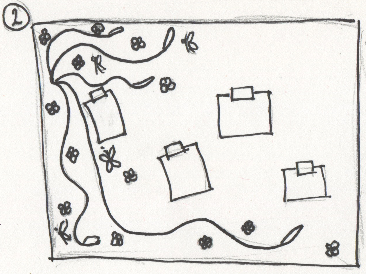
This is idea 2. I was thinking about the background being like a cork notice board, the drawing the floral pattern on by mac or by hand the scanning it in. The post it notes will be photographed and then uploaded. the post it notes will be by buttons to the rest of the website.


This is idea 3. This is to be designed with paint splatters on the background. the splatters will be bright bold colours so that the catch the attention of the viewer. the name of the website will be in the middle of the splatter. This is because the views attention will be aimed there when they first view the website. The small square boxes are the buttons that link the viewer to the rest of the pages.


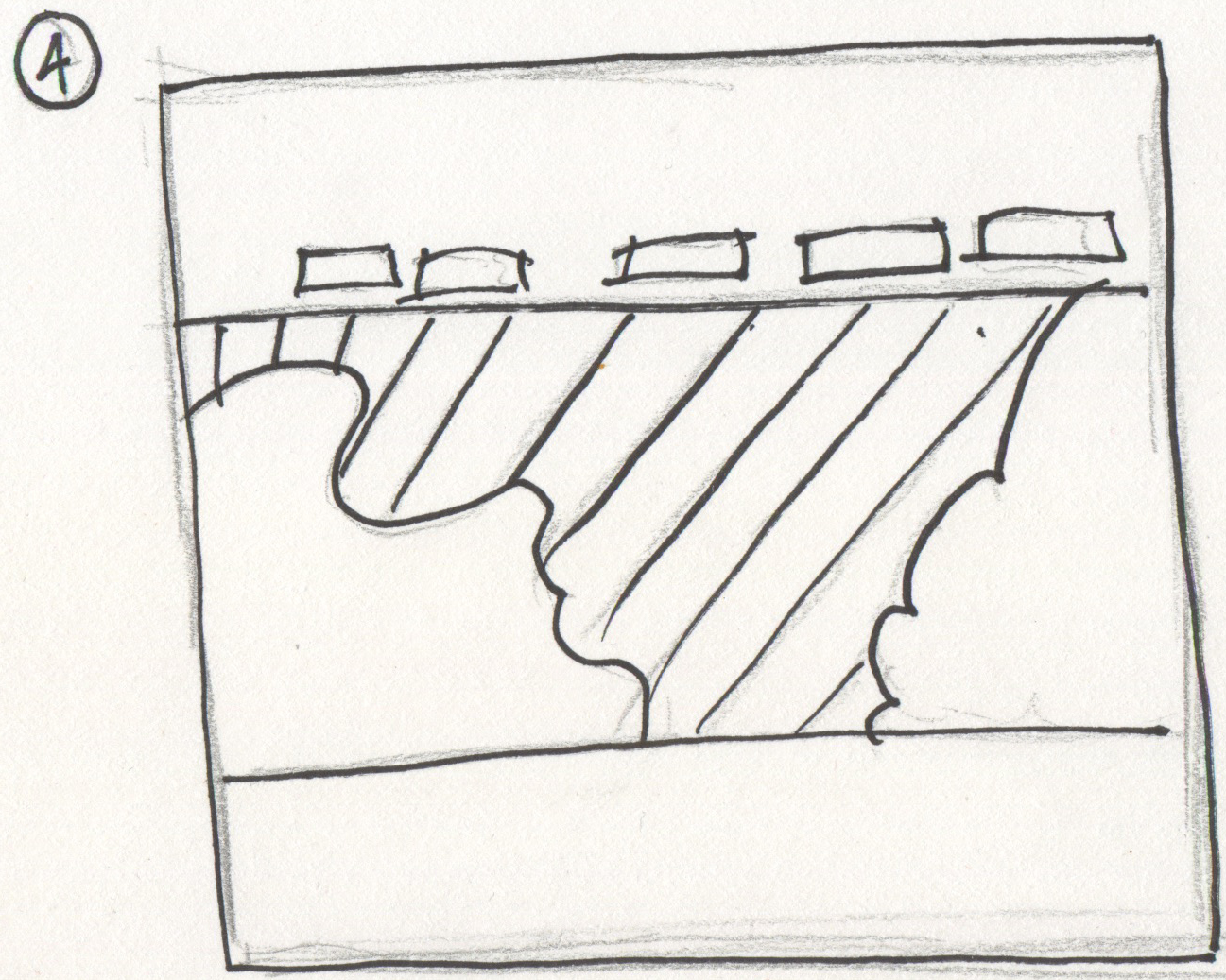
This is my 4th and final design. the focal point is the image that is in the center of the website. I will use a hand drawn image. I will use bright bold colours on this image. I will then have 2 bands of colour one at the top and the other at the bottom. the small squares are the buttons for the linking pages.

leave some feedback and let me know what you think. thanks x


Friday, 8 October 2010

higher education

As i have to start looking towards the future i am starting to look at higher education. i Have been looking into university courses that i feel i would be interested in. i am hoping to either go to university to look at advertising and branding or maybe doing an apprenticeship.

i have been using the ucas website to help me look at university courses that are available to me around the country (www.ucas.co.uk).

Friday, 1 October 2010

Magazine Project

another one of the projects we had to do in the first year was a Magazine project. we had to create a cover and double page spread for are own magazine that we was to create. We had to take all the images are selves and design it from scratch. one of the task we was asked to do was to create a replica of an existing Magazine cover, but changing the cover.

Here is the final outcome:

Retro Poster Project

Last year for are final project we was given a Retro design project. We had to design a poster for an existing company brand. I created a Retro poster for Heinz bake beans. I tryed out different ideas and colour ideas. Here is one of the final designs i came up with.


Aday at the beach

I went to the beach for the day with my family. I found this a perfect opportunity to pick my camera up and have a fun time taking pictures of different things at the beach. Here's what i took. Enjoy!


Hex colour code


Today we have been asked to look at hex colours. A hex number or decimal are a base of 16 numbering system used to define colours on web pages. a hex number is written from 0-9 and then A-F. Web colours are writtenas a three sets of hex pairs. the first set represents the red hue, the second the green hue, and the third blue hue. White is written as ff ff ff or #ffffff while black is 00 00 00 or #000000.


Here is an example of a Hex table: