For part of my Unit 10 we have to create a website that we can use for the final show that is shown at the end of the year. at the moment i am playing with ideas so have a look and let me know.
For the font of the heading title of my website i used a font called 'Sweetie pie'. the font i used for the navigation buttons that are scattered around the home page is 'Suplexmentary comic'. the ink splats on the background are created by brushes that i have downloaded for free from a website called Brush king.
Let me know what you think. cheers!
Friday, 26 November 2010
Friday, 5 November 2010
Website layouts
Today we have been looking at different layouts for are own websites that we have to create as one of are units. this website will also be shown in the end of year show.
In order to create my own website we have been looking at layouts of existing websites, most websites follow the same simple layout of a navigation bar on the left hand side and a header and footer. By looking at these i have decided i want my website to stand out from all the rest so i am looking to make mine unique to my own style.
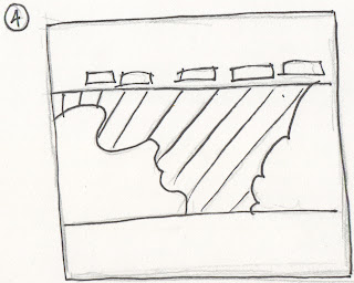
Here are some of the design ideas i have come up with. (Sorry! hand drawn bit wonky!)
This idea is to have a photo in the middle of arranged pieces of work or maybe photos, I'm not sure yet but anyway the smaller squares are the links to the other pages. The colour schemes are going to be browns and creams i think as i feel they would look great with a old fashioned styled image of the work in the middle.
This is idea 2. I was thinking about the background being like a cork notice board, the drawing the floral pattern on by mac or by hand the scanning it in. The post it notes will be photographed and then uploaded. the post it notes will be by buttons to the rest of the website.
This is idea 3. This is to be designed with paint splatters on the background. the splatters will be bright bold colours so that the catch the attention of the viewer. the name of the website will be in the middle of the splatter. This is because the views attention will be aimed there when they first view the website. The small square boxes are the buttons that link the viewer to the rest of the pages.
This is my 4th and final design. the focal point is the image that is in the center of the website. I will use a hand drawn image. I will use bright bold colours on this image. I will then have 2 bands of colour one at the top and the other at the bottom. the small squares are the buttons for the linking pages.
leave some feedback and let me know what you think. thanks x
Subscribe to:
Comments (Atom)


